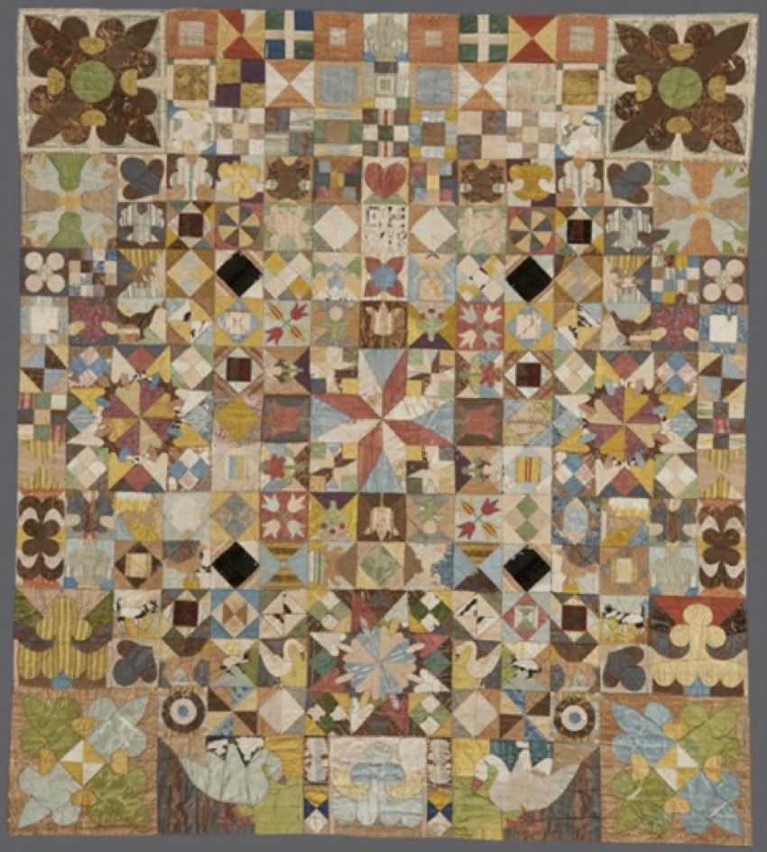
Purpose of this test
To decide the range of light and dark of the prototype. Range is the band of the percentage that is clearly dark and the percentage that is clearly bright.
Of course, since the textures of paper and fabric differ greatly, it is expected that the impression of light and shade will also differ greatly, but experts advise that the deviation should not exceed 10%.
Test method
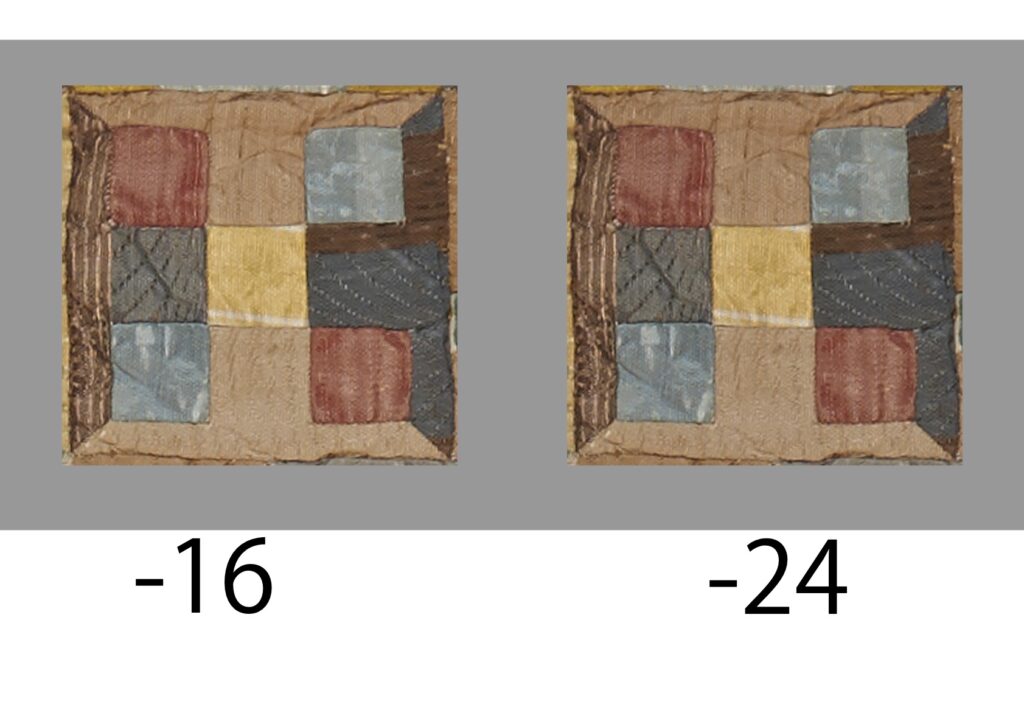
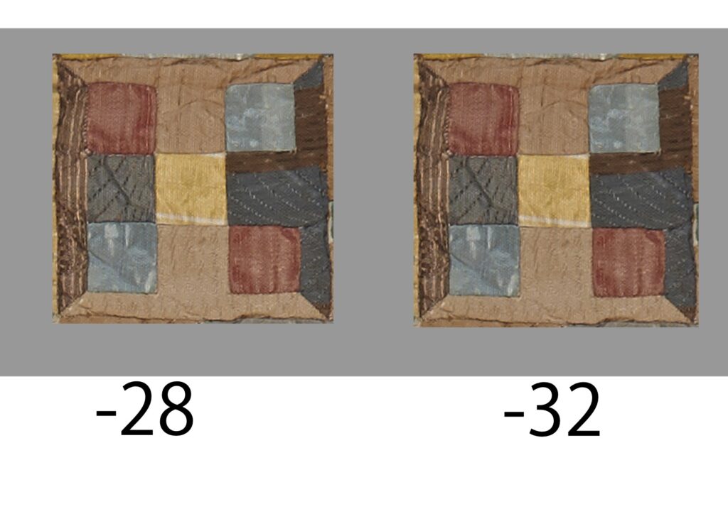
The light and dark data created in Japan will be sent to the UK for testing by comparing it with the real thing. At that time, color consistency is ensured by using Mac’s ColorSync. The prepared test materials are as follows. In fact, we first created data at 4% intervals from +16% to -24% and asked them to compare. As a result, -24% is the closest, so we created data for -28% and -32% and asked them to confirm that it is brighter than -28%.
Test results
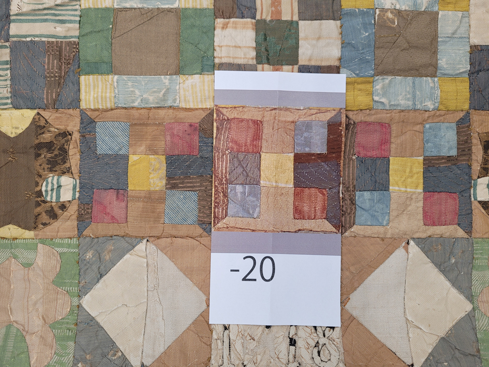
This is a picture of the results of a comparative test conducted on the UK side.
*Click to enlarge.
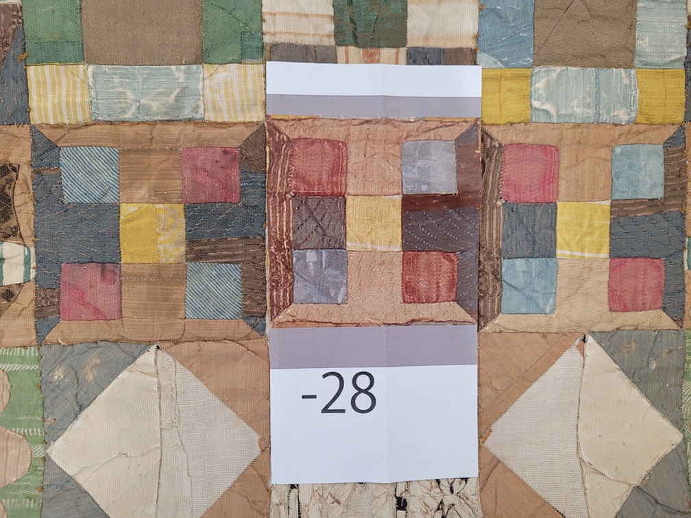
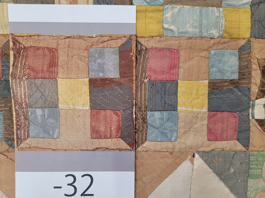
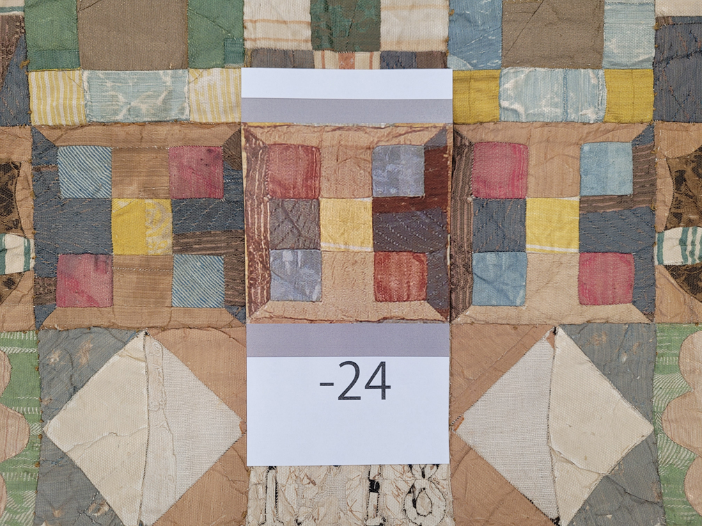
CONCLUSIONS FROM THE TEST
A: It was confirmed that the data did not need to be color-adjusted. For example, data with a strong reddish tone requires color adjustment, but we were able to confirm that it is not necessary. Of course, it was taken by an expert as a national heritage, so we thought it would be fine, but we was relieved to be able to confirm it.
B: Make a prototype with brightness adjustment set to -24% from the original data.
Of course, since the textures of paper and fabric differ greatly, it is expected that the impression of light and shade will also differ greatly. But expert advice that it would never exceed more than 10%.

